How to personalize app onboarding and paywalls?

TL;DR:
The paywall is your biggest revenue-mover, but a generic paywall will leak.
Another real conversion drop happens a few screens before the paywall.
Personalizing the onboarding that leads into your paywall, and the paywall itself, is what turns a cold offer into an obvious next step.
A user wants to learn Spanish and lands on your language learning app.
They land on a short onboarding flow, which doesn’t ask them a single question about what they’ve come for. Nor their struggles. A paywall that should close the sale is default and bland.
The user decides that they’d rather pass.
You think paywall is the problem, so you spend weeks rewriting the headline on the pricing screen while the real drop happens earlier, before the user ever sees a price.
That’s because most users decide fast, often on the first day, so the run-up matters as much as the sales screen.
The solution is to personalize the screens that lead into the paywall.
This way, the offer reads as the conclusion of a conversation, while you let the paywall itself reflect what the user just told you.
How does personalizing your onboarding make your app money?
A quick look at our most recent State of in-app subscriptions report shows it:
- Teams that run paywall and trial experiments earn up to 40x more revenue than teams that don't.
- The average active tester runs 14.7 experiments, mostly around personalization.
- 89.4% of trial starts happen on Day 0, holding between 87% and 90% across every region. Miss that first session and the chance a user ever starts a trial drops to 11%.
- Onboarding paywalls with a trial convert better than any other placement, at 1.78% on average. The screen personalization is also the highest-converting place to put your offer.
- Structural changes beat cosmetics. Visual and copy tweaks are the hardest paywall tests to win, while changes to placement, trial, and plan structure carry roughly 2x the LTV win rate of visual-only changes.
That last point makes the biggest case for tailored onboarding flows.
The biggest wins come from changing the structure of the journey. And personalization is the most direct structural change you can make, because it makes the paywall land.
When the screens before it have already named the user's goal and shown the app solving it, the offer stops feeling like a cold ask. It becomes a natural move forward.
A strong paywall design can increase purchase conversion by up to 30%, while pricing tests can increase ARPU by 30 to 50%. The key is to look at competitor setups, use proven market practices as a starting point, and A/B test.
What does a good personalized onboarding flow look like?
Duolingo is the onboarding example everyone reaches for, and rightfully so.
But there are a number of other valuable flows worth a closer look that get far less credit. Let’s go through them.
Onboarding flow example #1: Cal AI
Cal AI is a calorie-tracking app that isn't afraid to warm you up with 25+ onboarding cards before serving a tailored paywall that feels more like the last step than a hard sell.
The app guides you through a series of personal questions covering your weight, your habits, and your goals.

In between these questions, Cal AI sprinkles in some research-backed stats to reinforce credibility and keep momentum and buy-in.
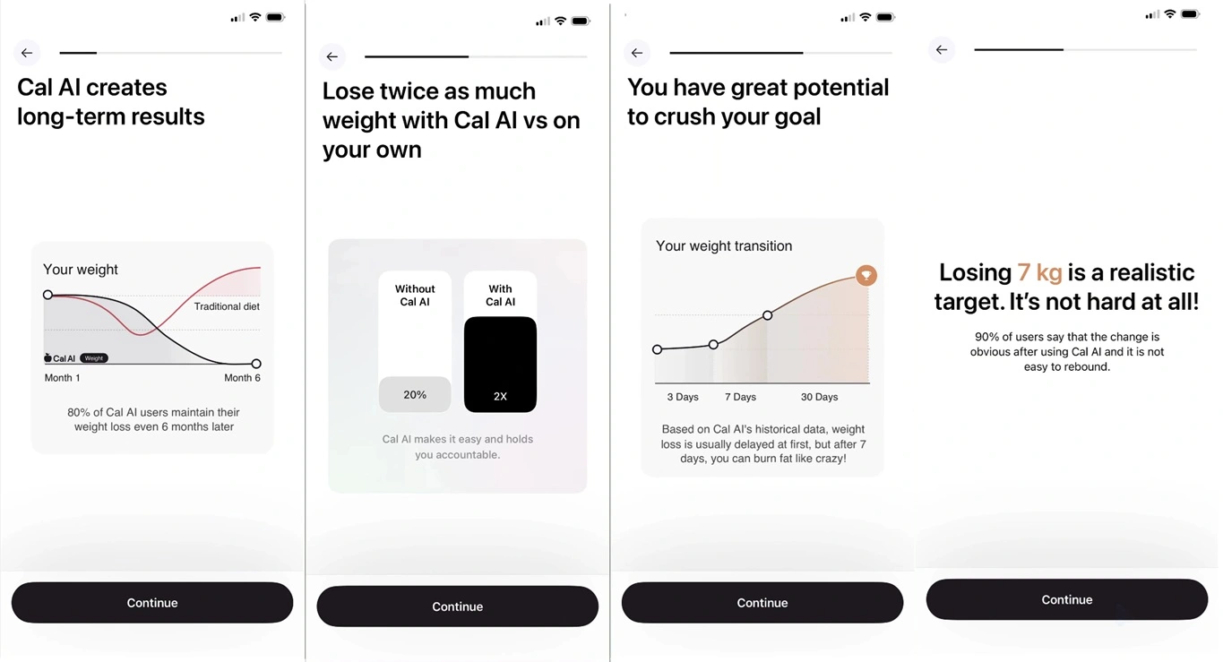
The whole flow gets users to self-reflect while positioning the app as a helpful companion rather than just a tool.
As you finish the conversational sequence, Cal AI has built a tailored calorie program just for you, locked behind a trial paywall.

💡Two teenagers built Cal AI into 15M+ downloads and $30M+ ARR in under two years, then sold to MyFitnessPal. A tailored onboarding-to-paywall flow like this one was a core part of that engine.
Onboarding flow example #2: Speak
Speak is a language learning app whose onboarding delivers on its name. You speak into your phone to answer the onboarding questions out loud.

That conversational moment adds a low-stakes first rep in the exact skill you came for, and it makes you feel like the app is already listening.
Speak then turns your inputs into personalized cards, showing that it got to know you from a short chat. A powerful psychological move.

By the time you reach the paywall, you've already had a real conversation. Better than filling out a form and closer to the app’s use case.
The app has acknowledged your goals and promised to help you reach them. A few more cards add social proof, and you're set to close.
Onboarding flow example #3: Flo
Flo is a women's health app known for a super complex onboarding branch.
One of the first steps of its onboarding is asking for your age. Then, according to the answer, it shows you a different “goals” screen:
- Youngest users will naturally lean towards understanding how their body changes and show interest in sex education.
- More mature users can choose between health, well-being, sexual, or pregnancy goals.
- Older users can also choose specific issues, like tracking menopause symptoms.
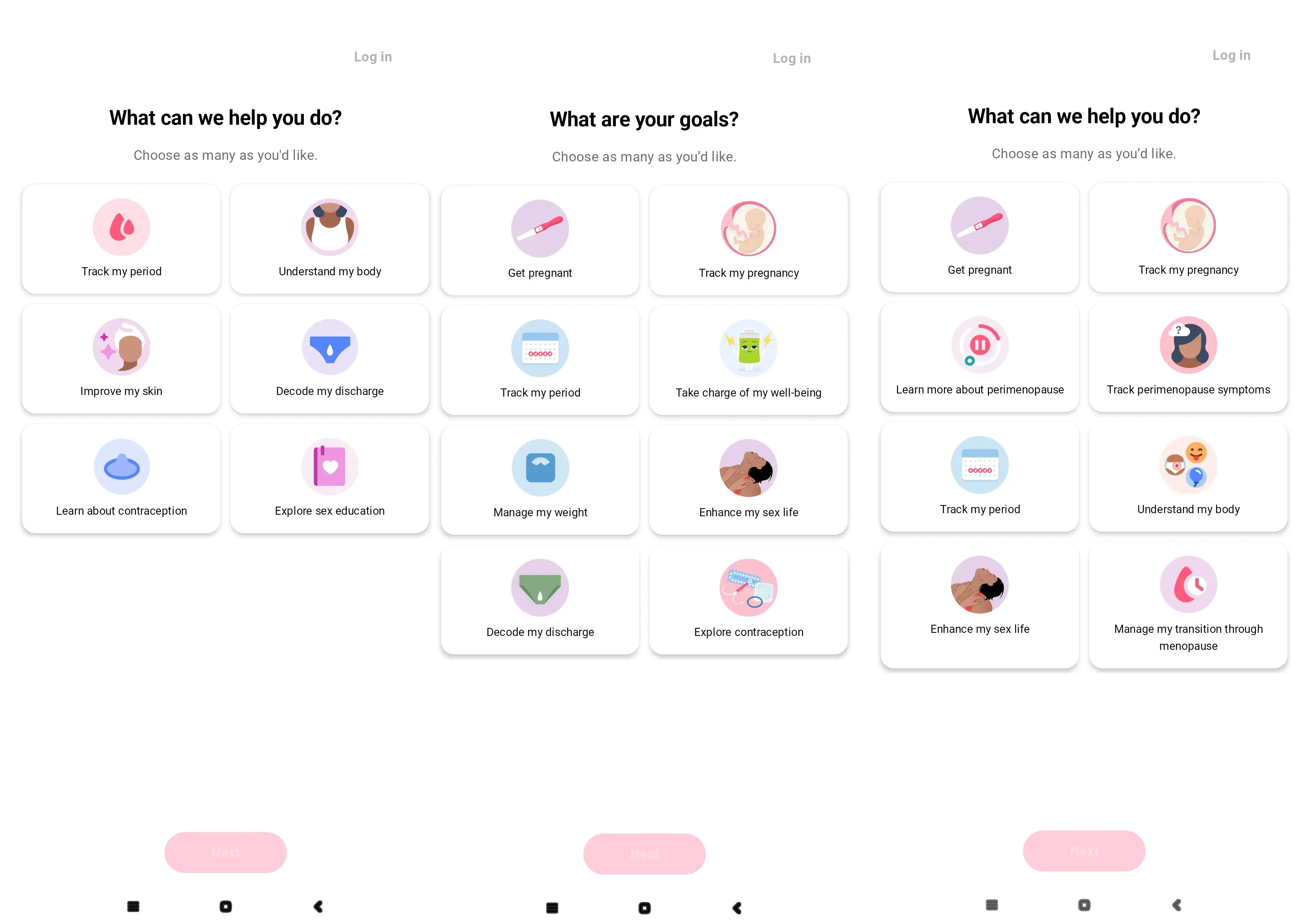
Depending on the goal you choose on any of these screens, Flo will branch out into a guided conversation.
Answers get instant feedback, and a long flow stops feeling like you’re filling out a form.
 (1).webp)
Then, just before the paywall, Flo adds a distinctive beat: a tap-and-hold gesture asking you to commit to your goal.
The mind immediately shifts to “should I back out of what I just committed to?"
A hard branch and this many cards may feel extensive, but our team also sees long flows hold up in health and fitness, even 25 to 30 screens, when every screen ties to a real user problem. Utility apps are the opposite: 3 to 5 is usually enough. Length follows category and motivation, so test yours.
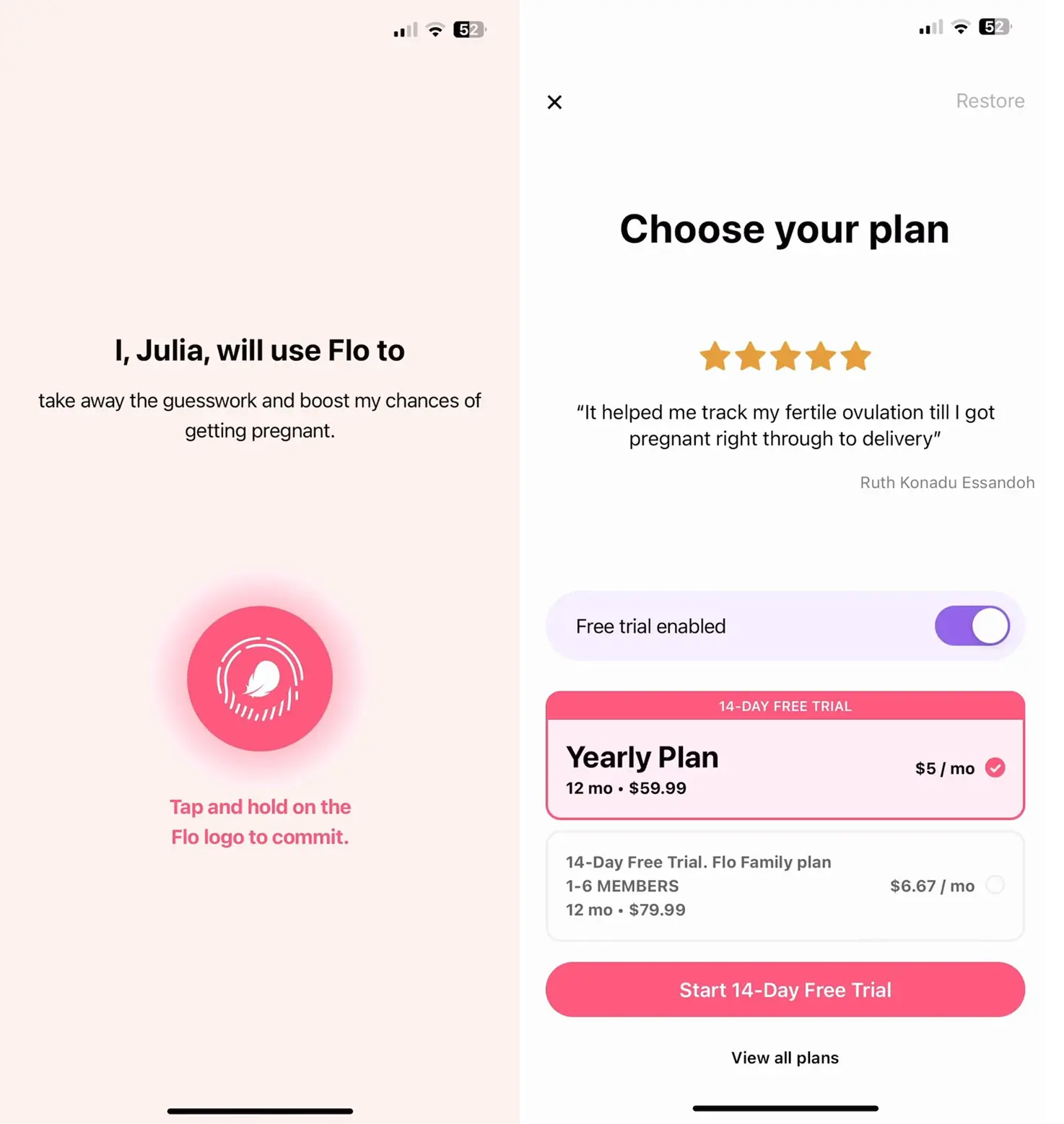
The paywall itself matches the branch you took, a cycle tracker, and an expecting parent sees a different framing for the same subscription.
ℹ️This branching runs deep. Flo's own engineering team has written about how their onboarding forks on goal, age, and running experiments, and the logic got complex enough that they built a custom visual graph tool internally just to manage it.
How do you build a personalized paywall flow without code?
Use Adapty’s Flow & Paywall builder.
We’ve built a visual, drag-and-drop editor where the whole journey lives as one flow: welcome screens, quiz questions, the paywall, and everything between.
Screens render natively, so they load instantly and feel like part of your app rather than a web page dropped into it. And every change happens from the dashboard.
You can edit copy, rearrange screens, or swap offers without waiting for an app store release.
For personalization, that single-flow setup matters more than the convenience:
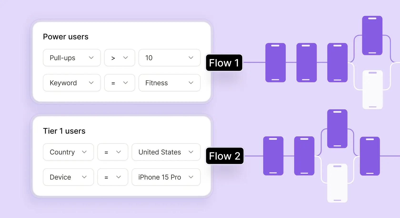
- Onboarding answers become variables any later screen can read.
- Navigation rules branch users down different paths.
- The flow gets measured as one funnel, so you see exactly which screen loses people, instead of guessing whether onboarding or the paywall moved the result.
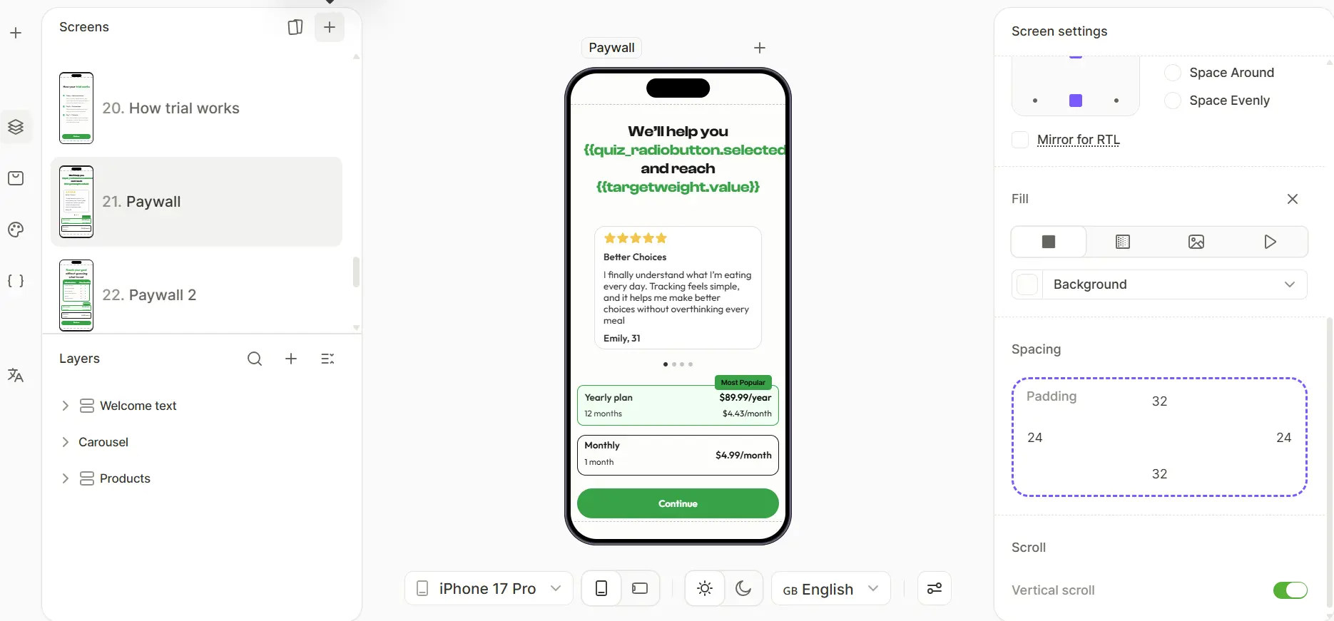
Here’s a step-by-step guide on how you can build one yourself, by using a calorie calculator app as an example.
Step 1: Create a welcome screen to provide app context
One or two screens that state what the app does and the outcome it promises.
Keep it short. This screen's only job is to earn the next tap.
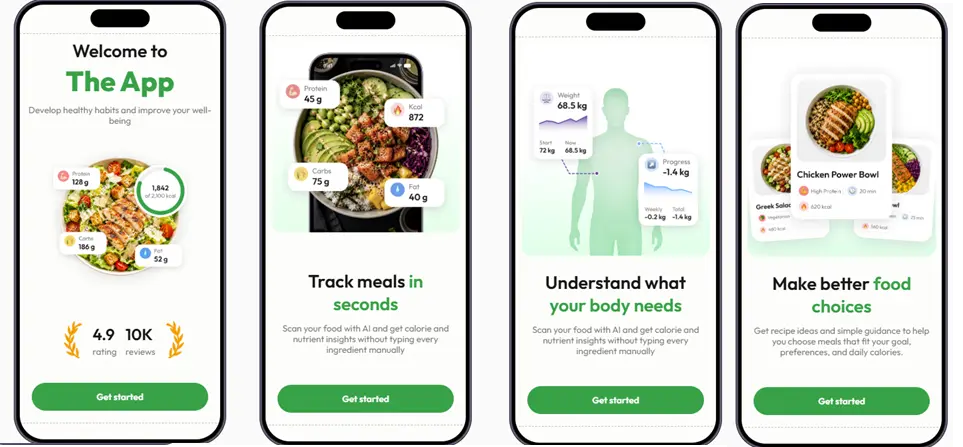
The welcome flow is an ideal place to sprinkle in some social proof, which you can do with a few clicks using the User Engagement block: ratings, reviews, or a quick testimonial carousel.
Step 2: Ask for a name
This is the user's first encounter with personalization, and it's where the builder starts earning its keep.
The name gets stored as a variable, so any later screen can greet the user directly, including the paywall headline.

Step 3: Start with a question
Add an onboarding screen that asks the user to pick a goal, say, lose weight, build muscle, or eat healthier, and store the answer as a variable.
A multiple-choice question creates the variable for you. From this point, every screen that follows can read it.
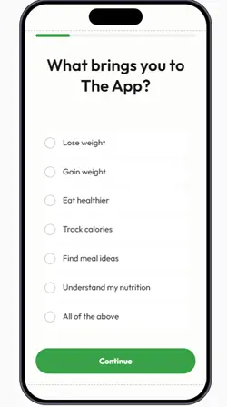
The easiest first step is adding onboarding questions. It's simple to implement and immediately gives users a feeling that the experience is personalized. It also helps you validate their answers later in the flow.
Step 4: Add a personalized screen to break the quiz question
Between questions, insert a screen that reflects back what the user just said: their name, their goal, or a stat relevant to the answer they picked.
For example, if a user picks the “lose weight” option, we can add a variable like this:

Notice how the two variables—the name and the goal—appear in the builder.
These breather screens keep a longer flow moving. The same trick Cal AI uses with its research-backed stat cards, for example.
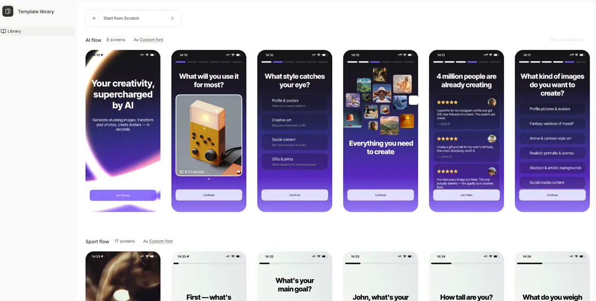
Step 5: Branch on the answer
Set a navigation rule that sends a user who picked one goal down one path and a user who picked another down a different one, each ending at its own paywall.
Both branches live inside the same flow, so you build them together, ship them together, and compare them in the same funnel.
Step 6: Add a personalized plan loading screen tied to the user's exact goal
A short "building your plan" moment that names their goal while a progress animation runs.
It signals that everything they answered went into what comes next, which is exactly what makes the paywall after it feel earned rather than generic.

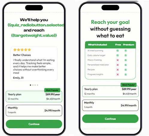
Step 7: Pull the variables into the offer
User's name goes in the body, their goal in the headline, and, if you want to go further, a script that turns their answers into a concrete number, a target date, or a projected result.
Publish from the dashboard, and the flow reaches users in seconds, no app store release needed.
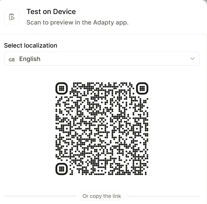
You can also test your paywall before you launch it via the Adapty app:
That's one flow. Yours will look different, and that's the point. Build it in Flow & Paywall Builder, ship it today, and let the numbers tell you what to change.
Best practices for building an onboarding and paywall flow
Here’s a short checklist version of everything above, in the order you'd apply it:
- Treat onboarding and the paywall as one funnel. The user decides on Day 0, across the whole sequence. Build and measure them together.
- Get the structure right before you personalize. Placement, trial setup, and plan mix carry roughly twice the LTV win rate of visual changes. Personalization multiplies a working paywall but it doesn’t rescue a broken one.
- Ask only questions you'll use. Every onboarding question should change a later screen: a recommendation, a branch, or the paywall copy. If you can't name the screen an answer affects, cut the question.
- Reflect answers back before you ask for money. Name the user's goal on the paywall, show a projection built from their inputs, or branch them to an offer that matches what they said. The offer should read as the conclusion of the conversation.
- Match length to motivation. A Health & Fitness user working on a real problem will sit through 25 screens, but a utility user maybe won't sit through 10. Test your category.
- Personalize where the traffic is. Start with the segments that cover the largest share of users. A flow for a market with 40 installs a week can't even produce a readable test.
- Don't default everyone into the same ending. Check whether trials actually out-earn direct purchase in your category, and keep discounts as a targeted nudge for stalled high-intent users, not a blanket offer.
- Keep testing after it works. Great teams run experiments all the time—14.7 on average per active tester. A flow that converts today is just the control for the next test.
ℹ️Quick win from our Professional Services team: "Adding an onboarding question like 'How did you hear about us?' for a health and fitness app, with options like doctor, TV, friend recommendation, or scientific article, made the app feel more credible and expert-led, and increased conversion by around 10%."
When is personalization not worth it?
The data we collected and what our Professional Services team sees across client accounts show that sometimes personalization costs more than it returns.
1. When your segments are too small to matter
The most common mistake our team sees is that a lot of clients reach for complexity before they have the number to justify it.
“"Instead of focusing on the top of the funnel, where we have the most users, clients often create narrow segments too soon. For example, building a separate flow for a specific country does not make sense if there is not enough traffic there. Personalization should start where it can impact the largest share of users."
There's a statistical reason this backfires beyond the wasted build time: a segment that gets 40 installs a week will never reach significance on an A/B test and you can't even learn whether the personalized flow works.
Segment where the users are.
2. When the answers don't change anything
A question only earns its place if it changes a later screen.
If the user's answer never shapes a recommendation, a branch, or the paywall copy, the question is just friction. Every unnecessary screen is a place to lose someone.
Test your onboarding: For each onboarding question, name the screen it affects. If you can't, cut it or move it past the paywall.
ℹ️Length itself is not the problem. Health & fitness flows can run 25 to 30 screens when every screen builds toward a real user problem, while utility apps often need only 3 to 5. What kills completion is screens that visibly go nowhere.
3. When you need a structural fix
Personalize a copy on a paywall that has the wrong structure, and you’ll polish the wrong layer.
Adapty's experiment data shows visual and copy changes are the hardest tests to win, while structural changes to trial setup, plan mix, and placement carry roughly 2x the LTV win rate.
Price tests improve conversion only 28% of the time, but lift LTV 46% of the time.
The order of operations matters: get placement, trial, and plan structure right first, then personalize on top of a working foundation.
A personalized headline on a paywall with six plans and no trial is a wasted experiment slot.
4. When personalization funnels everyone toward the wrong offer
Be careful of the two traps here.
Defaulting every personalized flow into a free trial: in some categories, direct buyers out-earn trial users, with Productivity at $56.95 in one-year LTV against $49.13 for trial users and Lifestyle showing a 21% gap in the same direction.
Treating discounts as personalization. Nine in ten subscriptions sell at full price, and even in Education, the heaviest-discounting category, only 14% of apps use them. A discount works as a targeted nudge for a user who showed intent and stalled. You show it to everyone and it just resets the price users expect to pay.
Look at our free trial versus direct purchase by category before a trial becomes your flow's only ending.
Build the entire journey
The paywall closes the sale. The screens before it decide whether the user is ready to buy when they arrive.
Flow & Paywall Builder lets you build both as one flow, personalize the run-up with the answers users give you, and test the whole thing without an app release.
Start where your traffic is, ask only the questions you'll use, and let the paywall reflect what the user told you.
See the patterns and benchmarks behind this in the State of in-app subscriptions report, or open Flow & Paywall Builder and build your first flow on your own funnel.